Esri’s Disaster Response Program helps support worldwide incidents, such as earthquakes, floods, wildfires, and severe weather. To increase public knowledge of the disaster impacts, we wanted an app to highlight areas and show related statistics, such as data that shows who may be affected within an impacted area. The area could be a wildfire perimeter, an earthquake shake map, a flood delineation, etc. Within that area, we would show data related to the event. Out of these requirements, the Impact Summary template was born.
Image may be NSFW.
Clik here to view.
How does it work?
The Impact Summary template is an interactive map that allows you to select a predetermined area of interest and display information related to that area in report boxes. It works great for presenting disaster impacts, but could be used for nearly anything (eg Crime Maps, Outage Maps, Health Care Maps, etc). You can select one area at a time by clicking on the map, using the renderers in the side panel, or you can also select all areas to get a summary of the data (integer data only).
Wondering where can you get access to this innovative template? You can download the code from GitHub and host it on your web server or let us host it for you by publishing an application on ArcGIS Online. Here are the steps we took to build the example app:
- Publish a service: To get started, pick a layer you are interested in presenting. In this example, we used a simplified USGS Shakemap from the 1994 Northridge Earthquake and published it as a feature service.
- Conduct your analysis: We used the Enrich Layer workflow in the web map in conjunction with an aggregation of Critical Infrastructure data from HAZUS. To select our variables for geoenrichment, we used the new Data Browser. We searched for variables we were interested in to understand what the impact of such an earthquake would be today. For this template, the analysis you highlight must consist of counts (integer values), typically answering the question “how many are in this area?”. Image may be NSFW.
Clik here to view.
- Prepare the web map: Add the service to a web map. If your layer of interest has levels of impact or other magnitude, change the symbology accordingly. For instance, we used the “GRID_CODE” which represents the potential impact. Image may be NSFW.
Clik here to view.


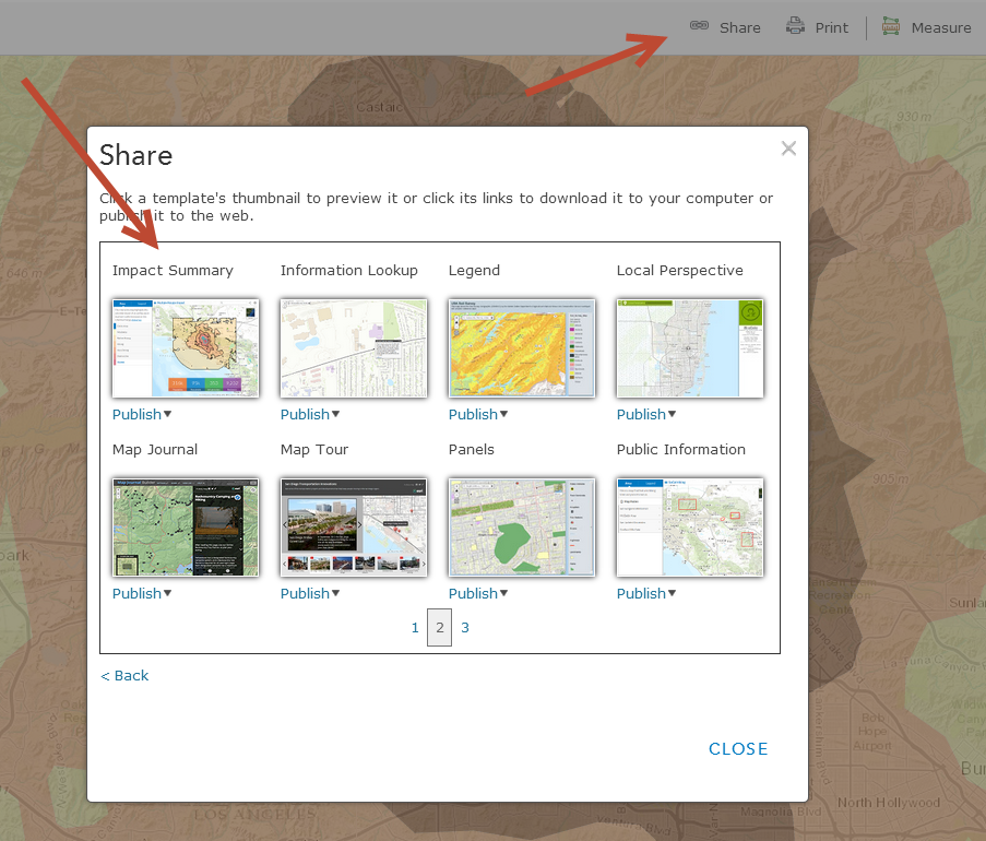
- Share the web map using the Impact Summary templateImage may be NSFW.
Clik here to view. - Use the Builder: It’s easy to configure the app with the included builder. Using the builder, you can configure which variables you’d like to highlight. You can pick up to 4 main variables (parent variables) to display and users can click on either of those 4 to display a carousel of additional variables (child variables). Essentially, you can allow your audience to drill down into more information or related variables. You can also customize the interaction and theme of the application. For instance, we suggest the dark theme with light basemaps.
Image may be NSFW.
Clik here to view.
Image may be NSFW.
Clik here to view.


The app is responsive and beautiful; it will adapt to any screen resolution. Also, the template includes functionality to share your app with others or embed in websites or blogs.
This application is provided so that you can share your spatial analysis and present it in a way that your audience can understand. We are looking for your feedback on how to make this easier to use or more compelling for your audience, please use GitHub and ArcGIS Online (use comments) to share your thoughts. Thank you to all of our early adopters who helped improve this application in the past few months.
Get out there and create some impactful maps!
